In small towns with low diversity, according to a new map of Twitter data created by HSU geography professor Monica Stephens and her students.
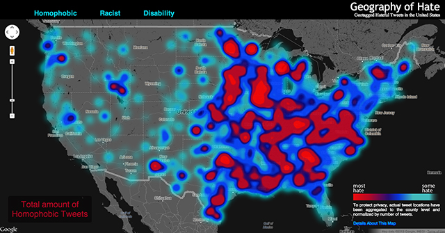
Stephens and three undergrads mapped the geographic location of 150,000 tweets that used racist, homophobic or anti-disabled slurs from June 2012 to April 2013.
Students read each tweet in its entirety to make sure it was being used in a derogatory way, then aggregated and normalized the data by county.
What they found is a high concentration of hate speech—like the n-word and the f-word—in isolated areas.
“It proves our hypothesis that areas with low diversity use more derogatory slurs against racial and sexual minorities,” Stephens says.
Another interesting finding? A clustering of the word “wetback”— a derogatory slur used against migrant workers—in Texas.
States east of the Mississippi also used more slurs than the western United States. But that can be attributed to greater population density and higher Twitter usage in those areas.
Stephens was compelled to create the map after recent discussions on hate speech censorship and online bullying.
She says that while social intolerance can’t be measured in tweets alone, it does underscore the prevalence of derogatory slurs in the United States.
“Regardless of the intention behind it, it’s clear that hate words are still a very real part of our culture,” Stephens says.
Funding for the map was provided the University Research and Creative Activities Fellowship at HSU. Twitter data was obtained from the DOLLY project at the University of Kentucky.
The three students involved in the project were Amelia Egle, Matthew Eiben and Miles Ross. They won Best Digital Map (second place) at the California Geographic Society’s annual conference.
Read more about the map and Stephens’ research methods at floatingsheep.org, an academic site that maps and analyzes geocoded information from user-generated sources.
The map has gotten media attention in the Guardian, Gawker, and the Atlantic Cities.